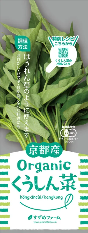
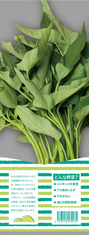
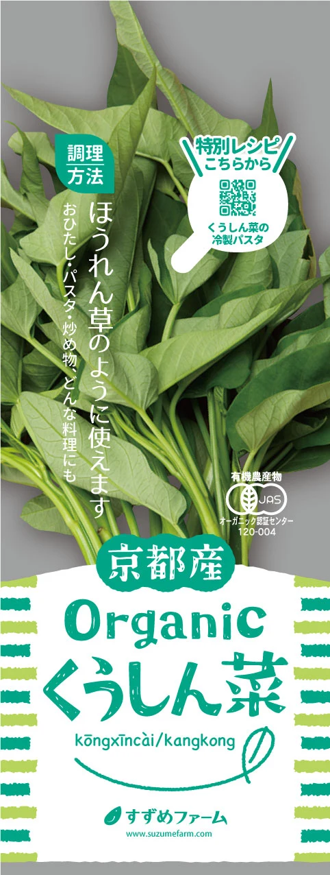
Organic produce packaging
A considered balance of print and transparency, letting the produce speak.
Independent graphic design studio
Thoughtfully made. Clearly communicated.
Graphic design that brings out the best in your products,
your shop and your business. A creative partner, close at hand.
 PACKAGING / PRINT / COMMUNICATION
Beyond how it looks: what it says, who it reaches,
and how it works. A selection of considered design projects.
Select a project to view the images and design notes.
A considered balance of print and transparency, letting the produce speak.
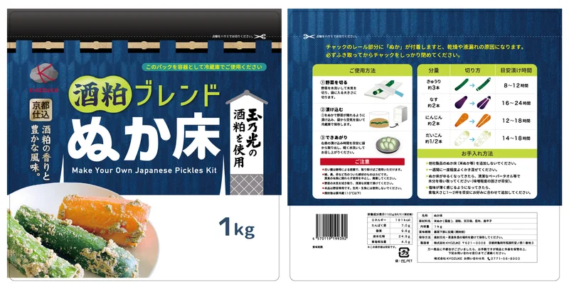
Product character and approachable instructions, brought together in one pack.
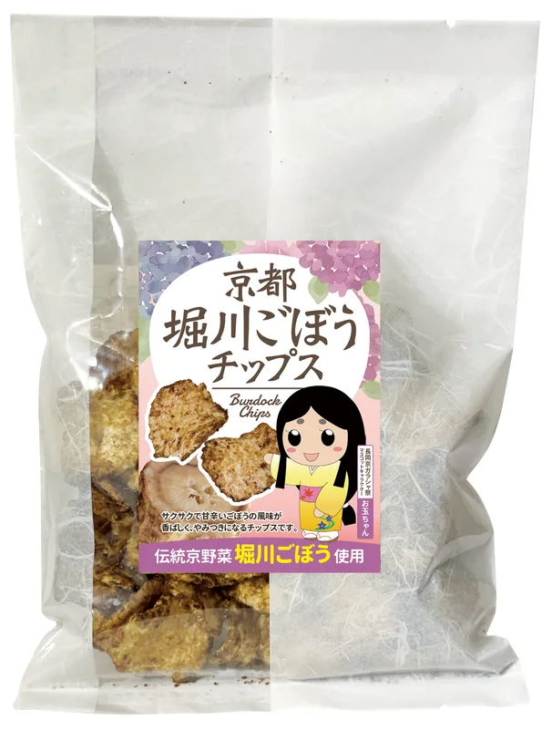
A regional story expressed through distinctive, approachable label designs.
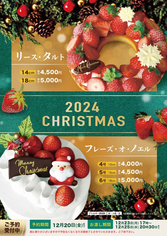
Seasonal excitement, with clear details that make choosing easier.
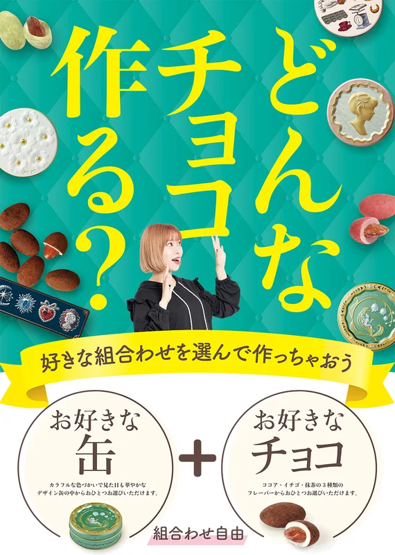
Making the joy of choosing feel immediate and inviting.
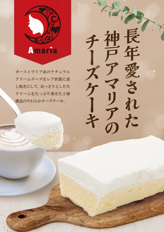
A calm, tactile composition that lets the cheesecake take centre stage.
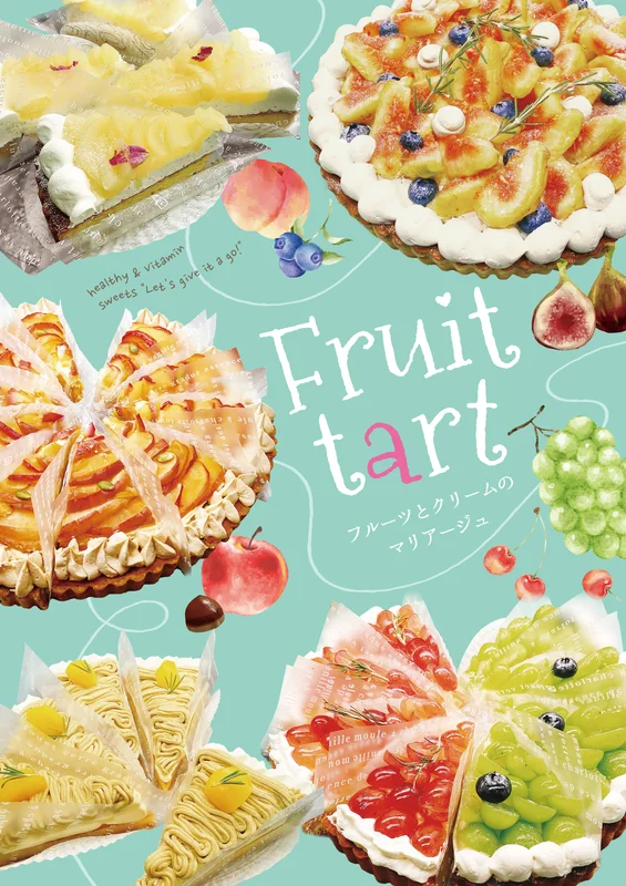
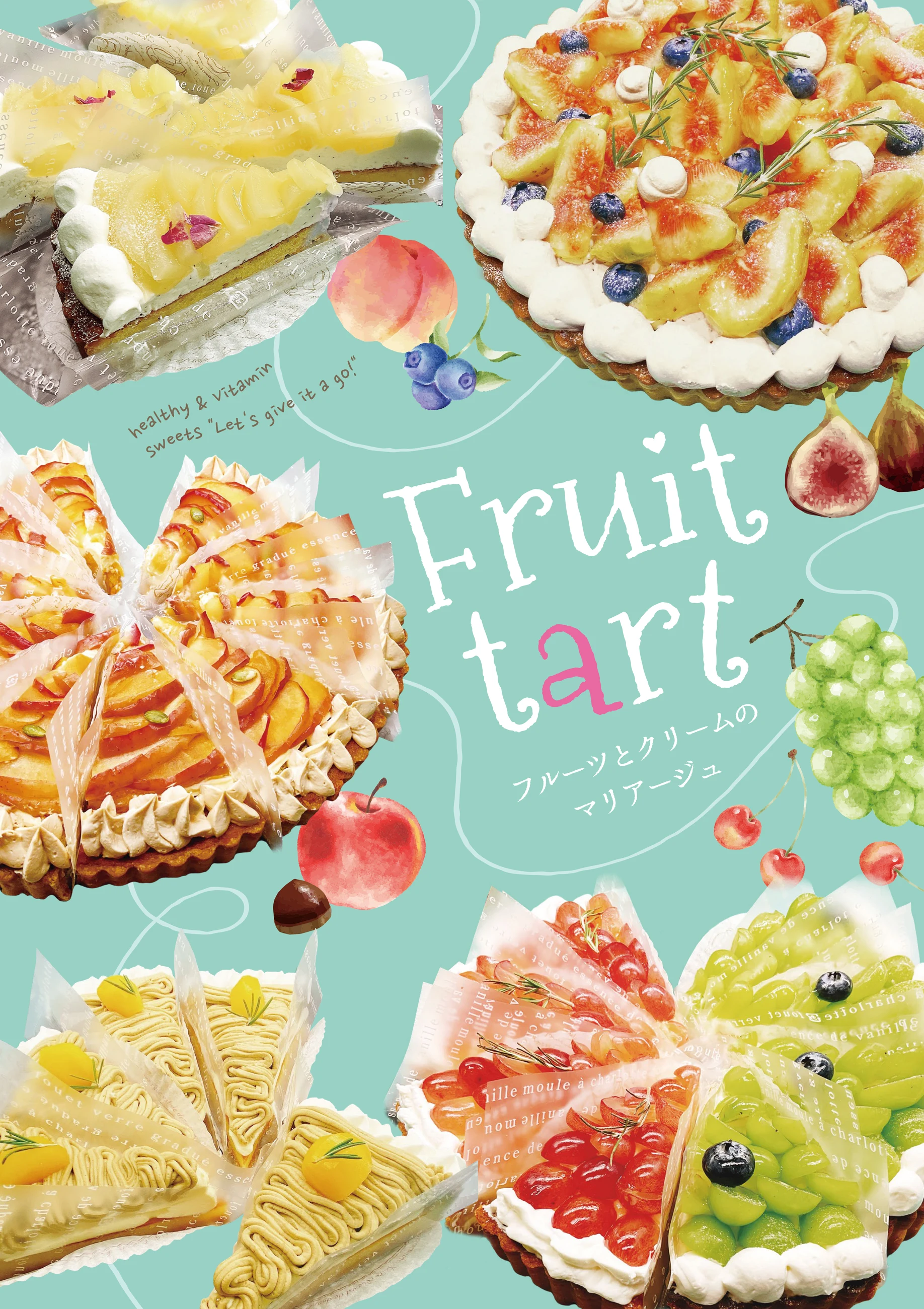
A light, colourful composition led by the fruit itself.
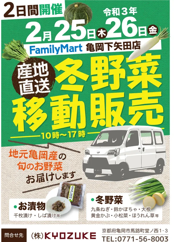
What, where and when, communicated at a glance.
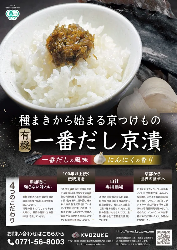
Moving beyond product information to show menu possibilities.
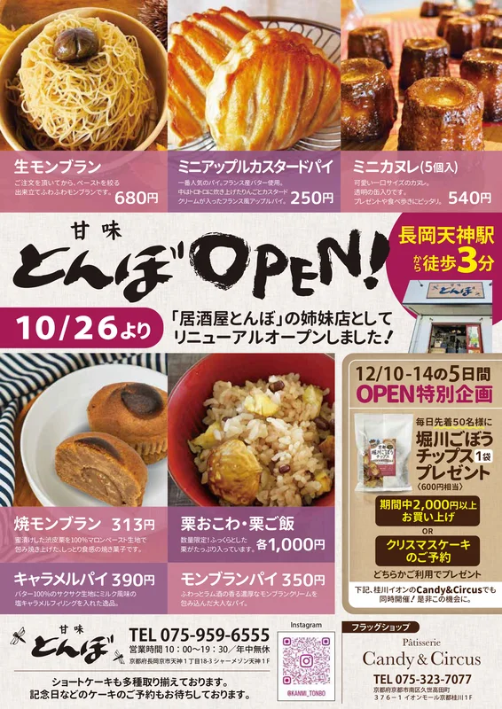
Appetising imagery, connected to the details needed for a visit.
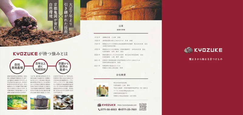
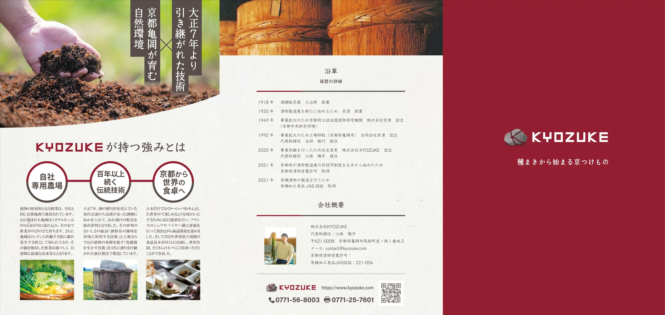
A folded narrative, from the maker's story to the product range.
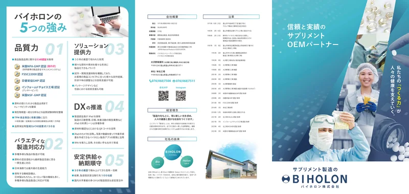
Making a specialist business approachable through clear information design.
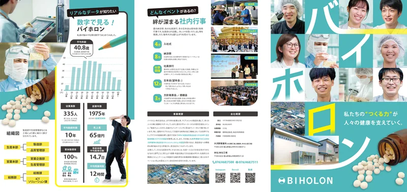
Communicating a workplace through the people who make it.
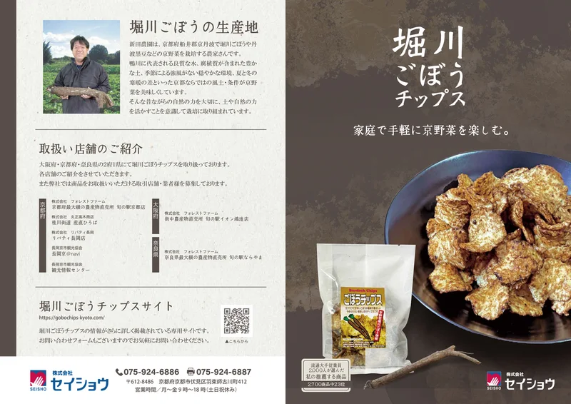
Telling the ingredient story behind a simple snack.
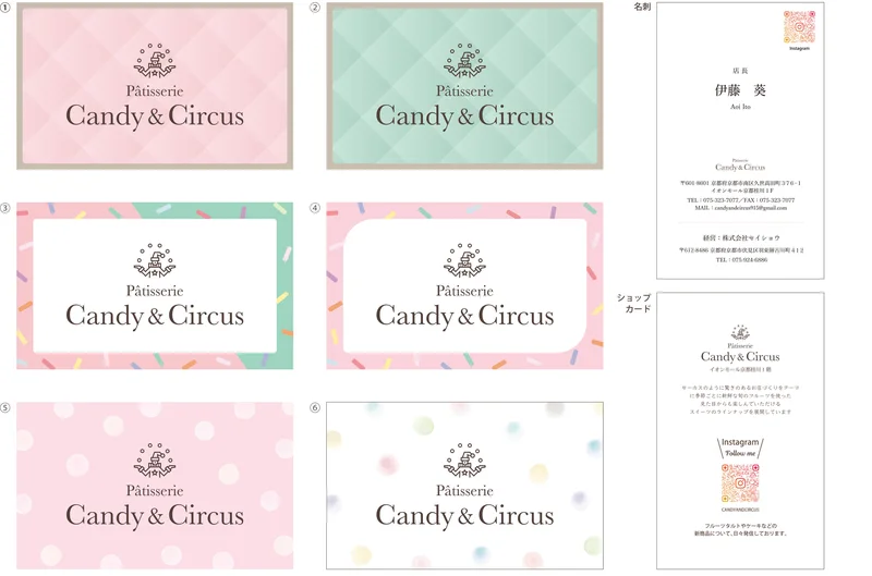
A soft, recognisable shop identity in a compact format.
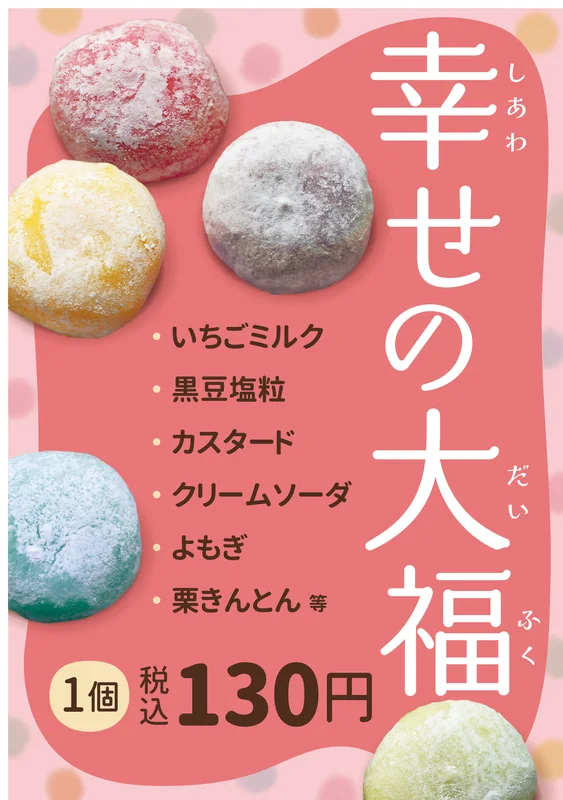
Turning colourful sweets into an inviting choice.
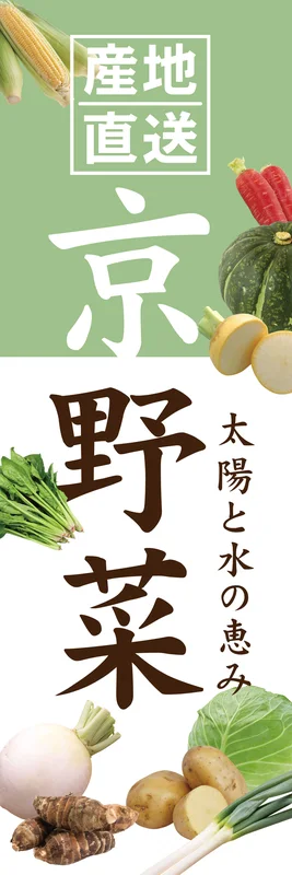
Large type and a clear vertical rhythm for visibility at a distance.
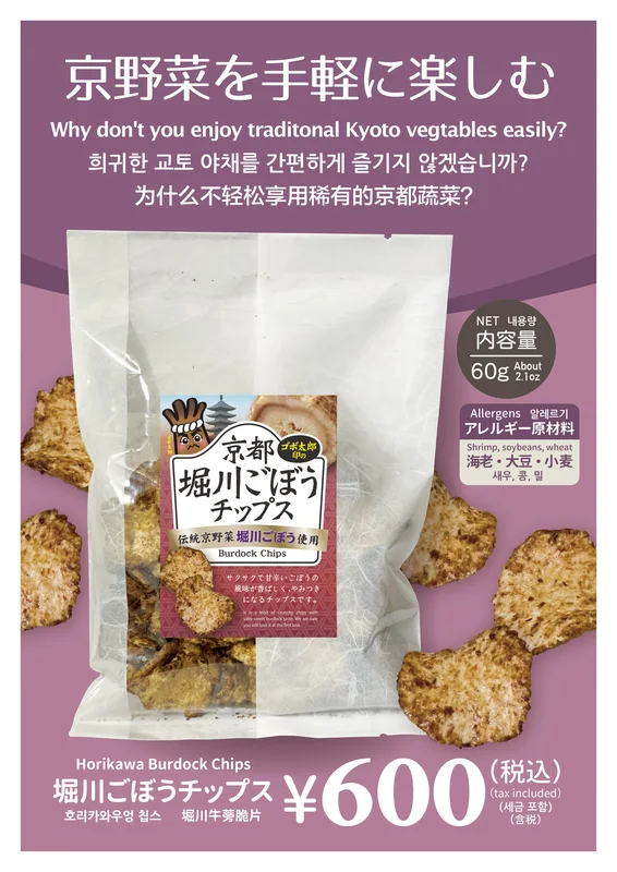
Helping visitors understand the product, its flavour and its price.
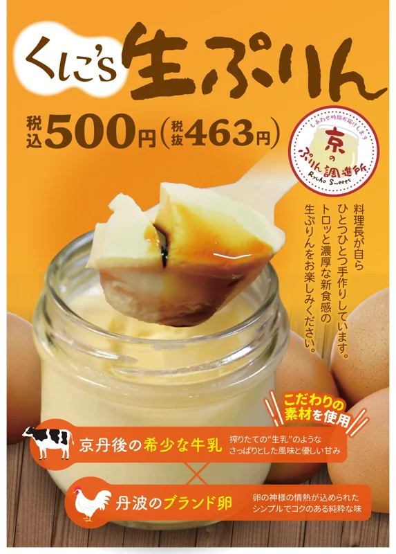
A spoonful of texture, made the focal point.
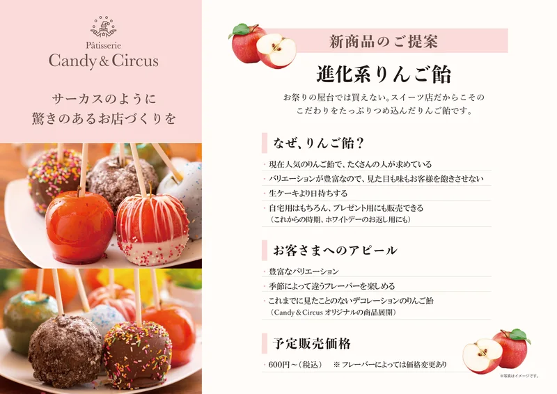
From discovering the product to enjoying it at home.
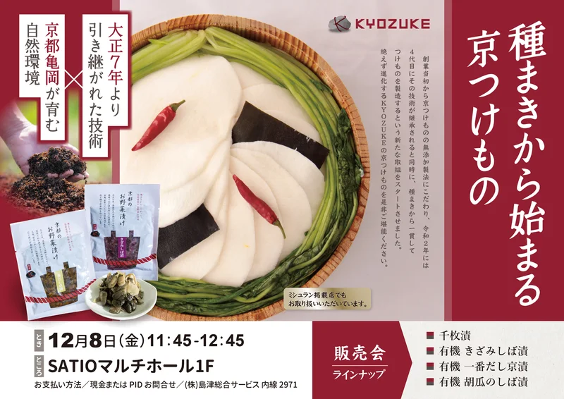
Ingredient appeal and event details in one clear composition.
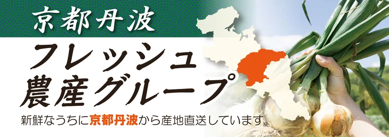
Making origin and product identity clear across a wide retail sign.
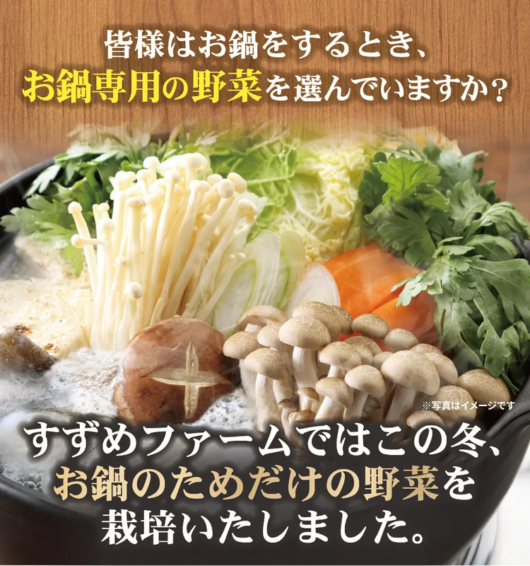
A steaming hotpot brings the serving occasion to life.
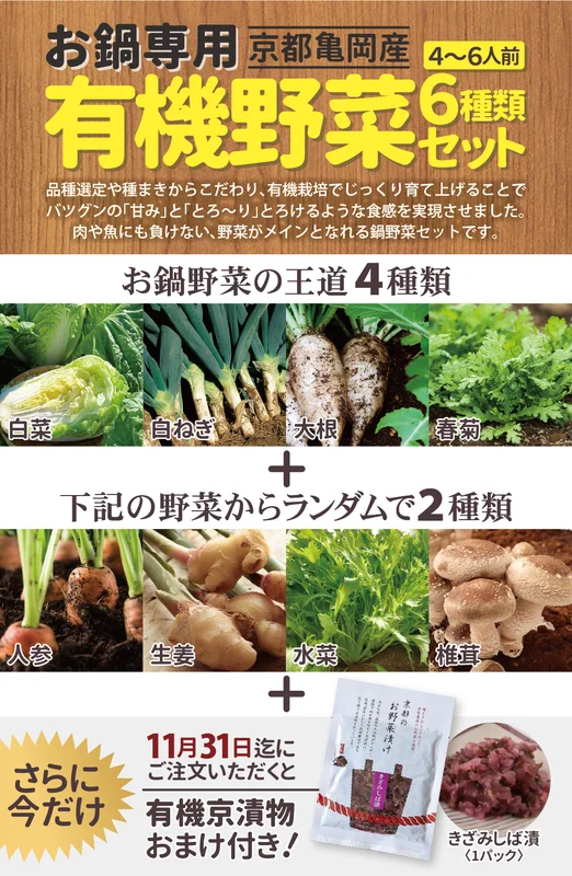
Photographs and clear numbers explain what is included.
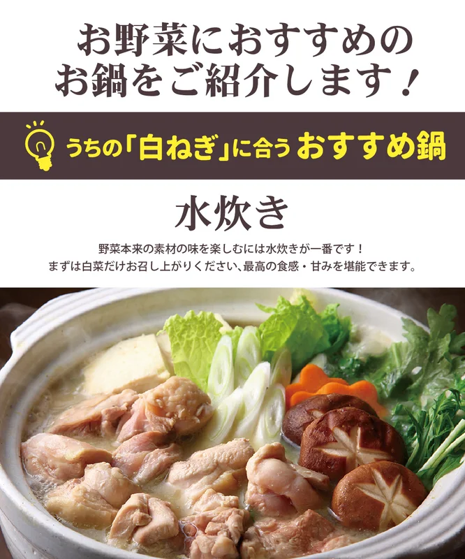
A finished-dish photograph makes the serving idea tangible.
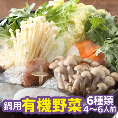
A compact image that keeps the product and set information visible.
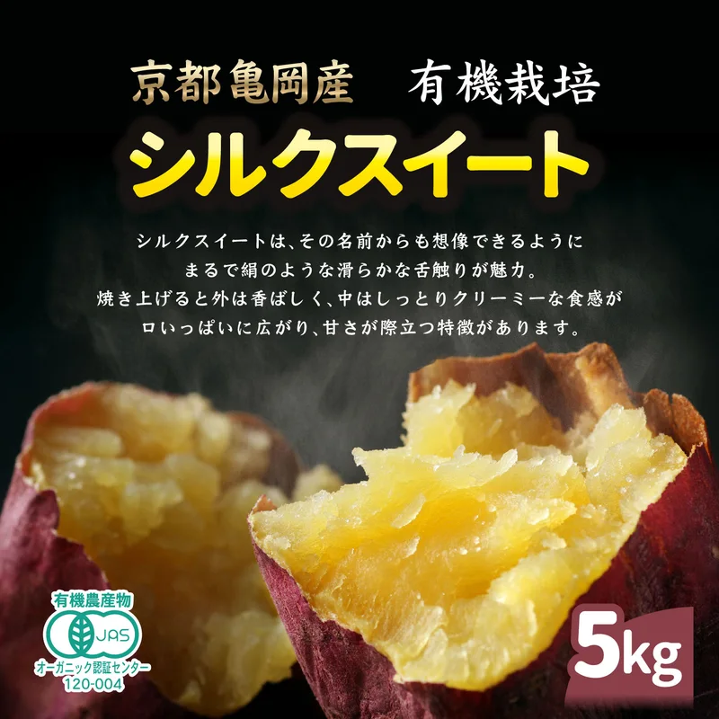
Colour and texture lead the product introduction.
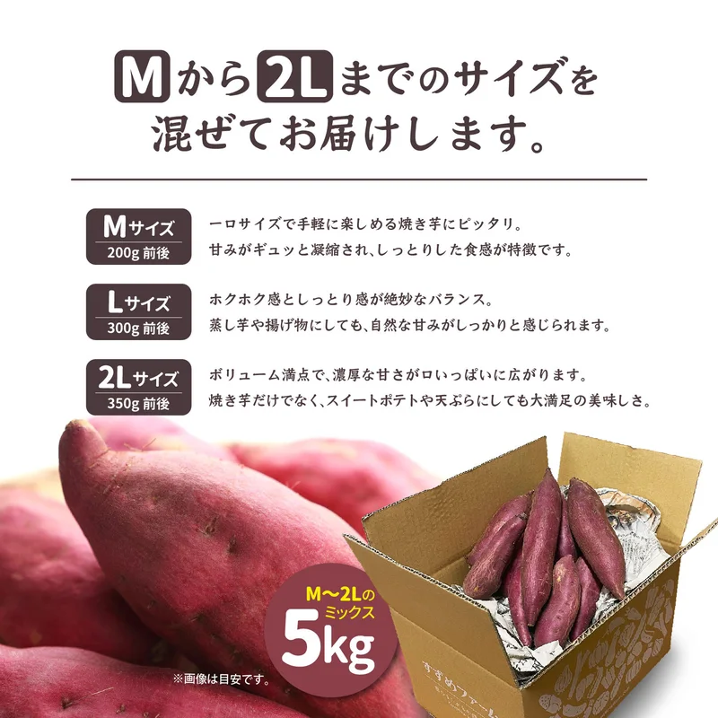
Size and quantity, organised for easy comparison.
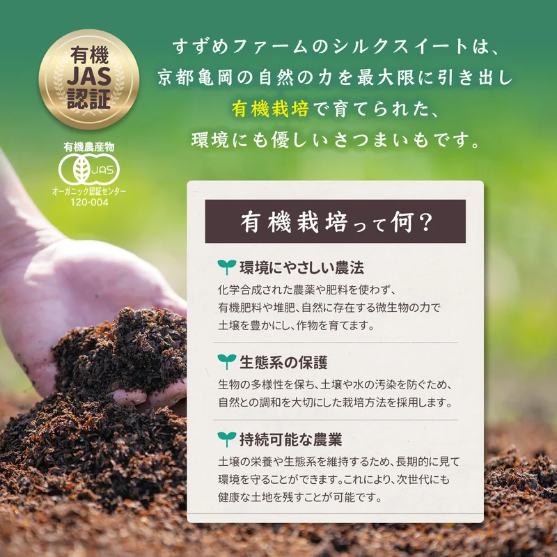
Headings and icons make the growing information approachable.
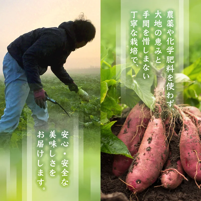
Field and harvest photographs tell the story behind the product.
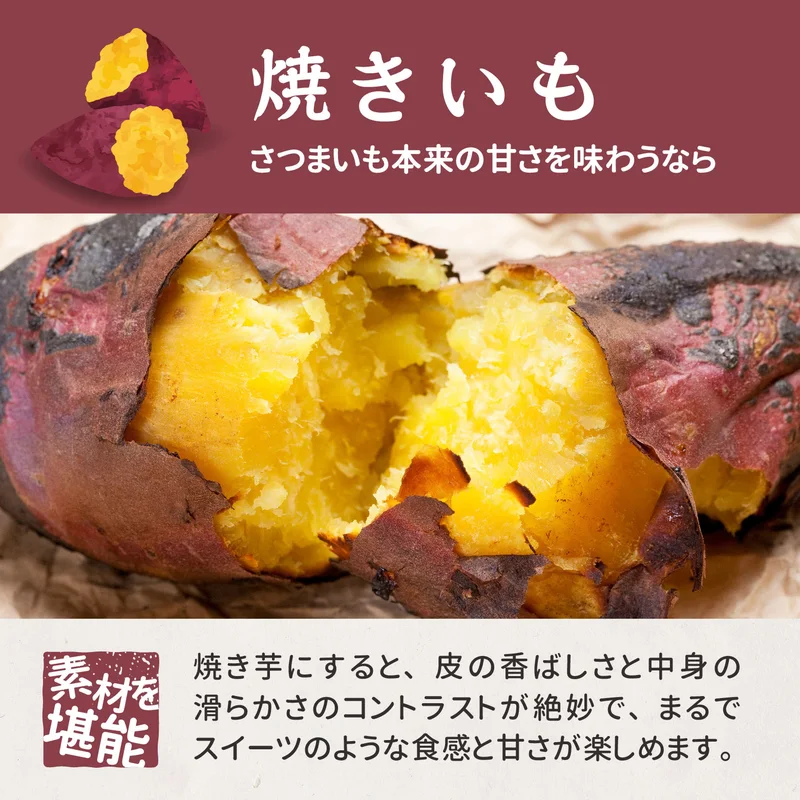
A close-up helps convey the experience of eating it baked.
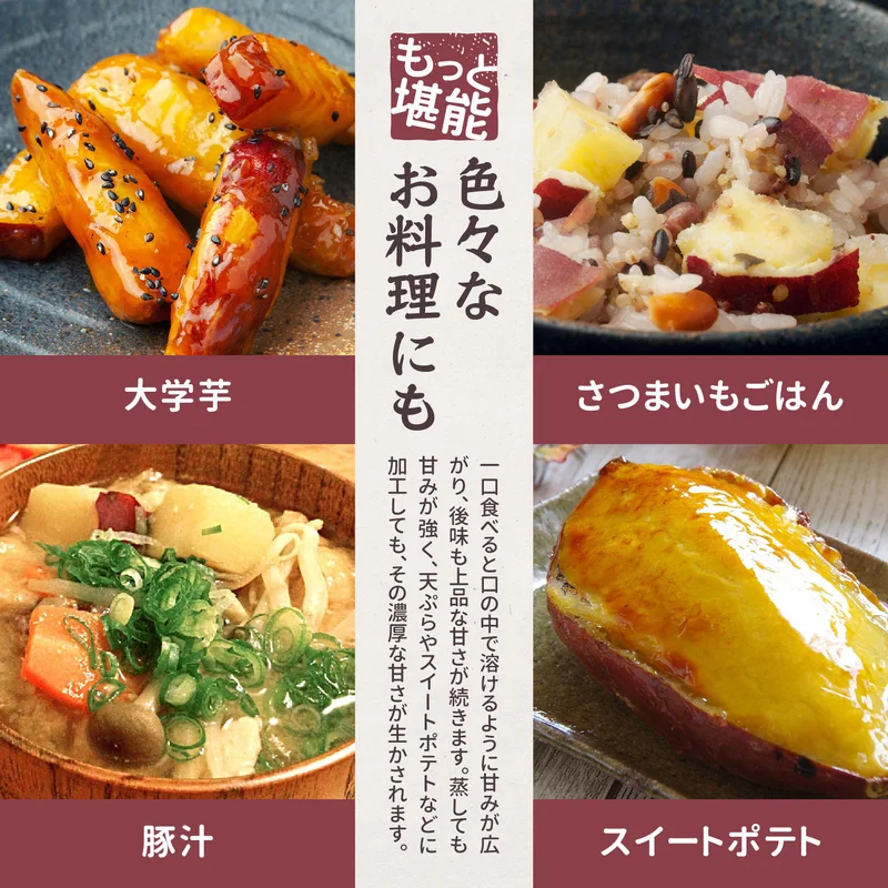
Four dishes show different ways to bring it to the table.
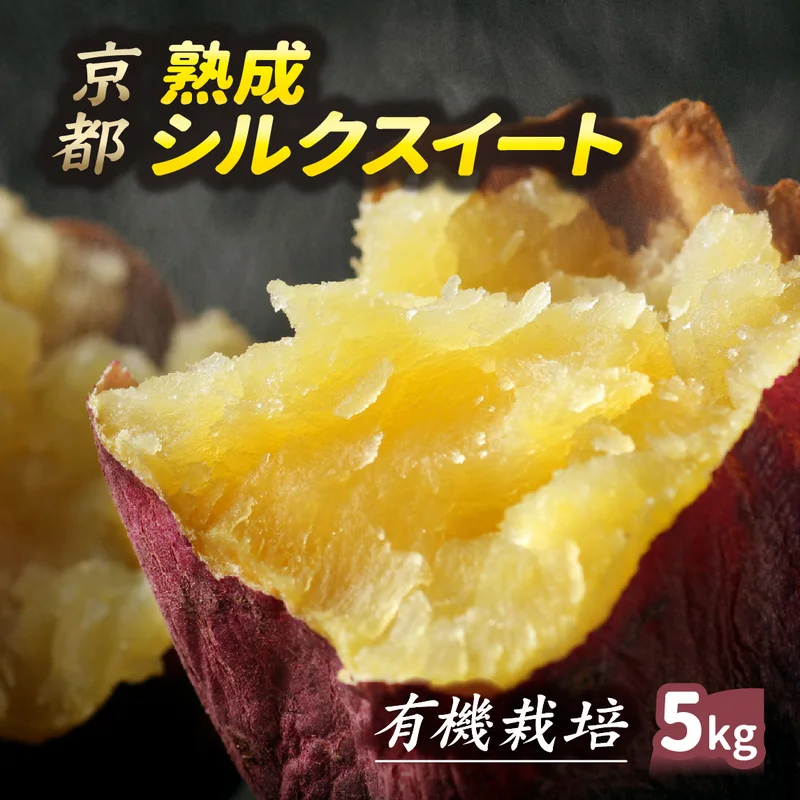
A focused thumbnail built around the product name and photograph.
Finding the right form for what you want to say.
From one thoughtfully designed piece to a coordinated set of materials.
Packaging & labels
Distinctive packaging that communicates the product, with consideration for print, production and everyday use.
Flyers, posters & brochures
Clear visual hierarchy and considered layouts that make information inviting and easy to understand.
In-store & sales materials
Point-of-sale displays, banners, signage and sales tools designed around how and where they will be used.
E-commerce & illustration
Product imagery that works on screen, alongside approachable illustrations with character.
Chika
GRAPHIC DESIGNER
CHIKA DESIGN is an independent graphic design studio run by Chika. I work with small businesses, independent shops, producers and growing companies to communicate what makes their products and services special.
You do not need a perfectly defined brief to get started. Through conversation, we can turn your ideas into thoughtful design that feels right and works in practice.
Have a project in mind, or just a question?
Tell me a little about what you are planning.
Early ideas are welcome. We can shape the brief together.